Nina Hidaka
Nina Hidaka (she/her) is a Toronto-based graphic / brand designer who was raised in Japan. She specializes in brand identity and visual communication. Currently, she is enrolled in the Honours Bachelor of Brand Design program at the School of Design at George Brown College.
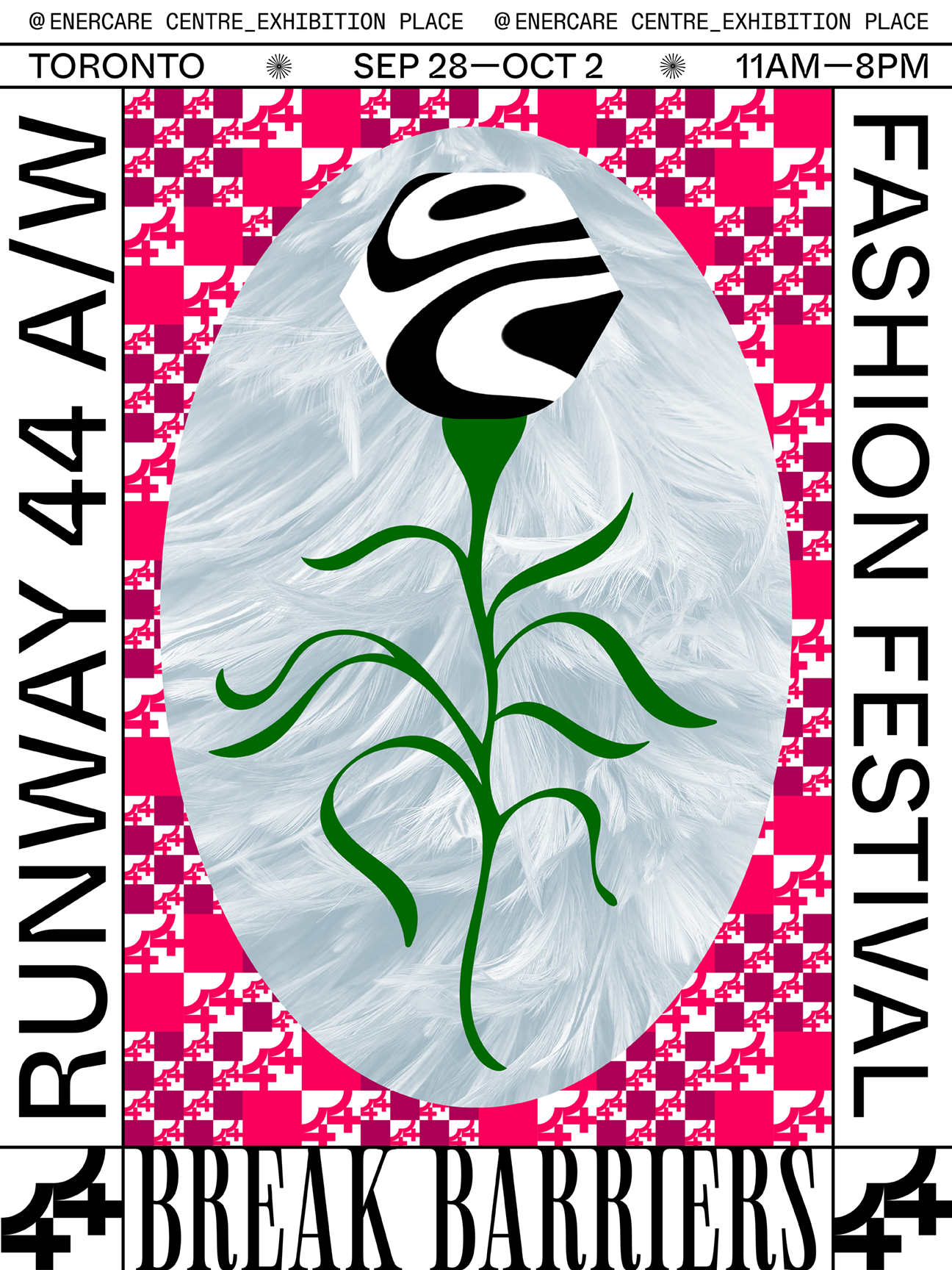
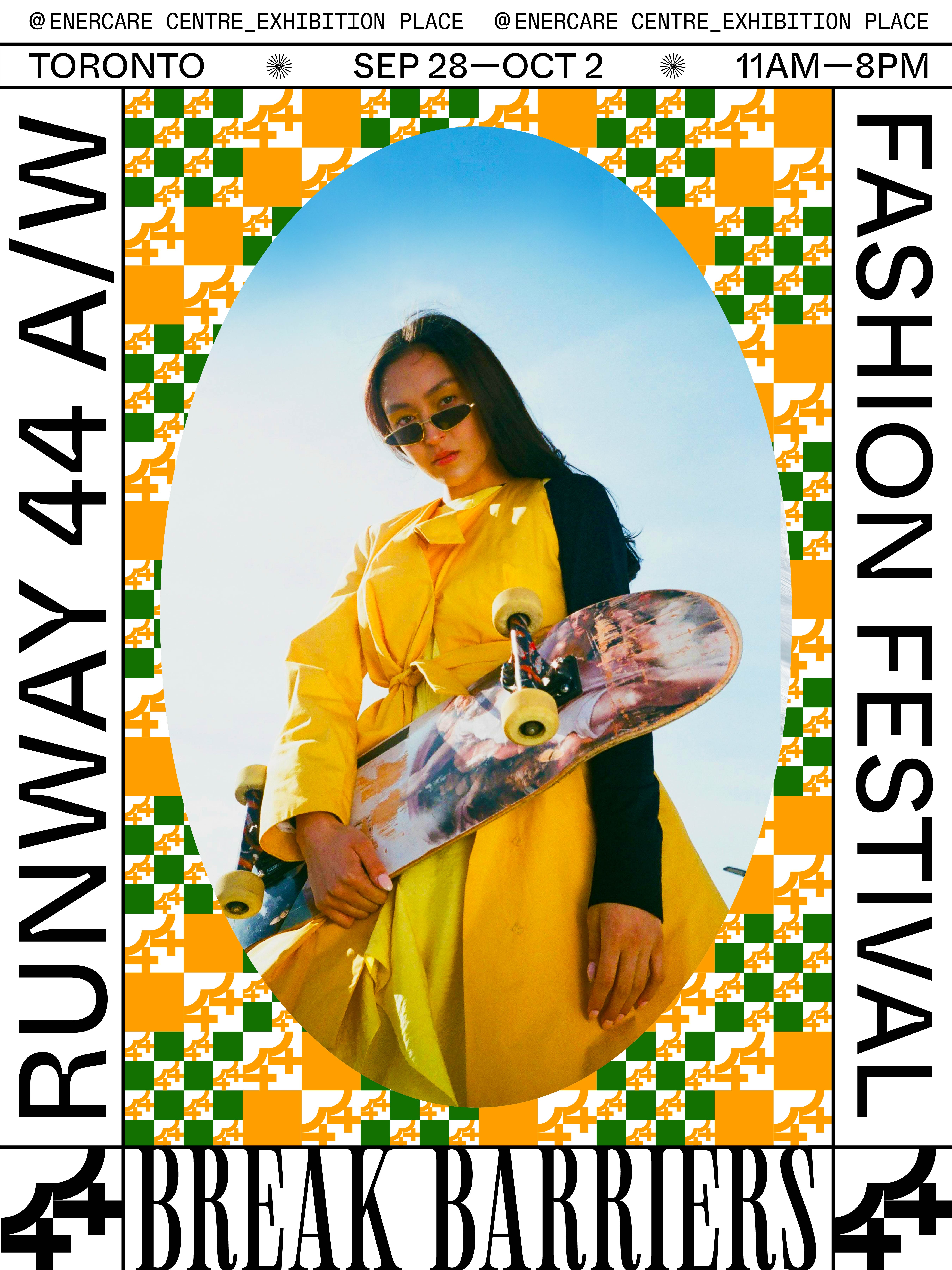
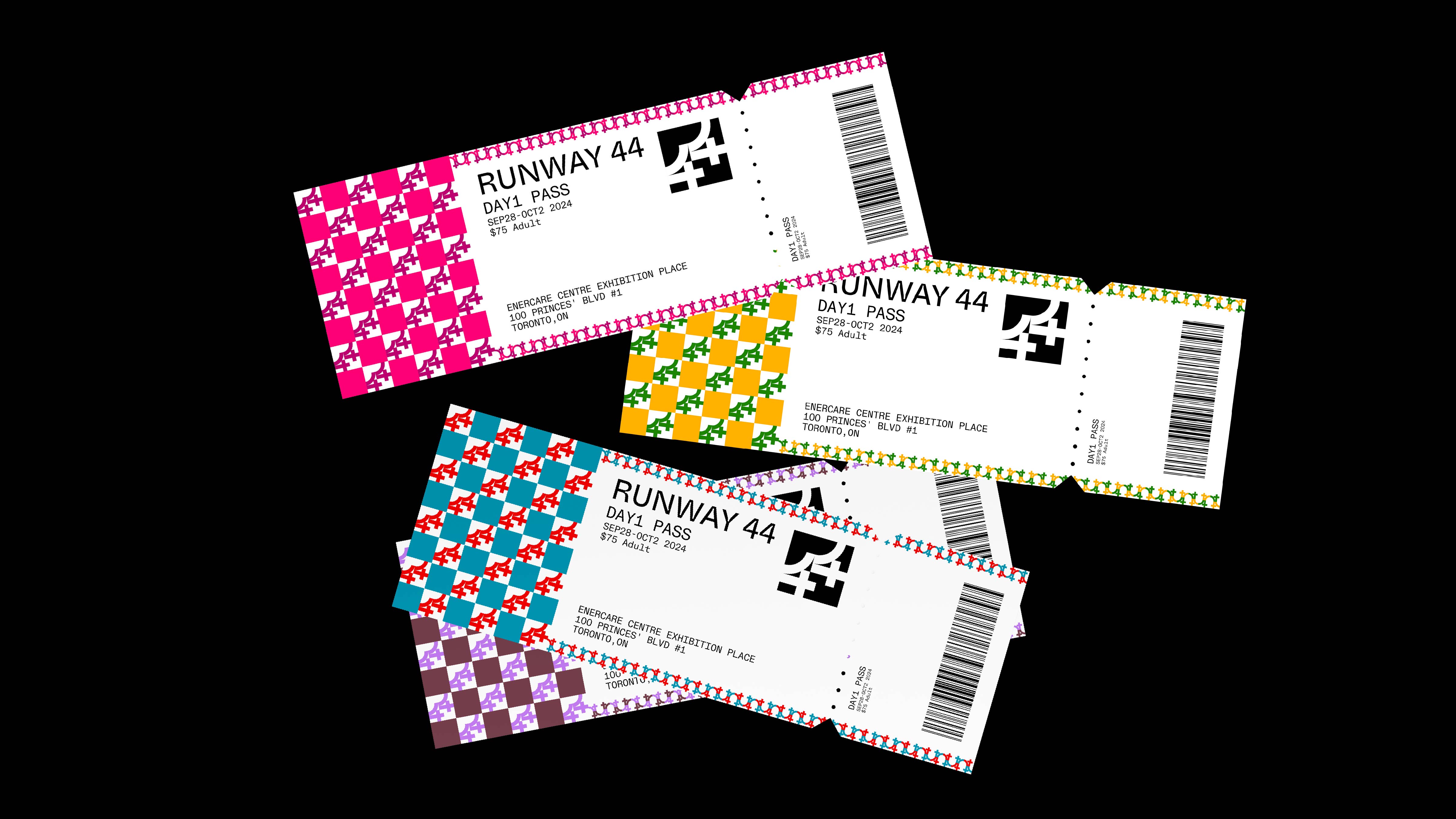
RUNWAY 44
Branding
Print
Digital
Digital
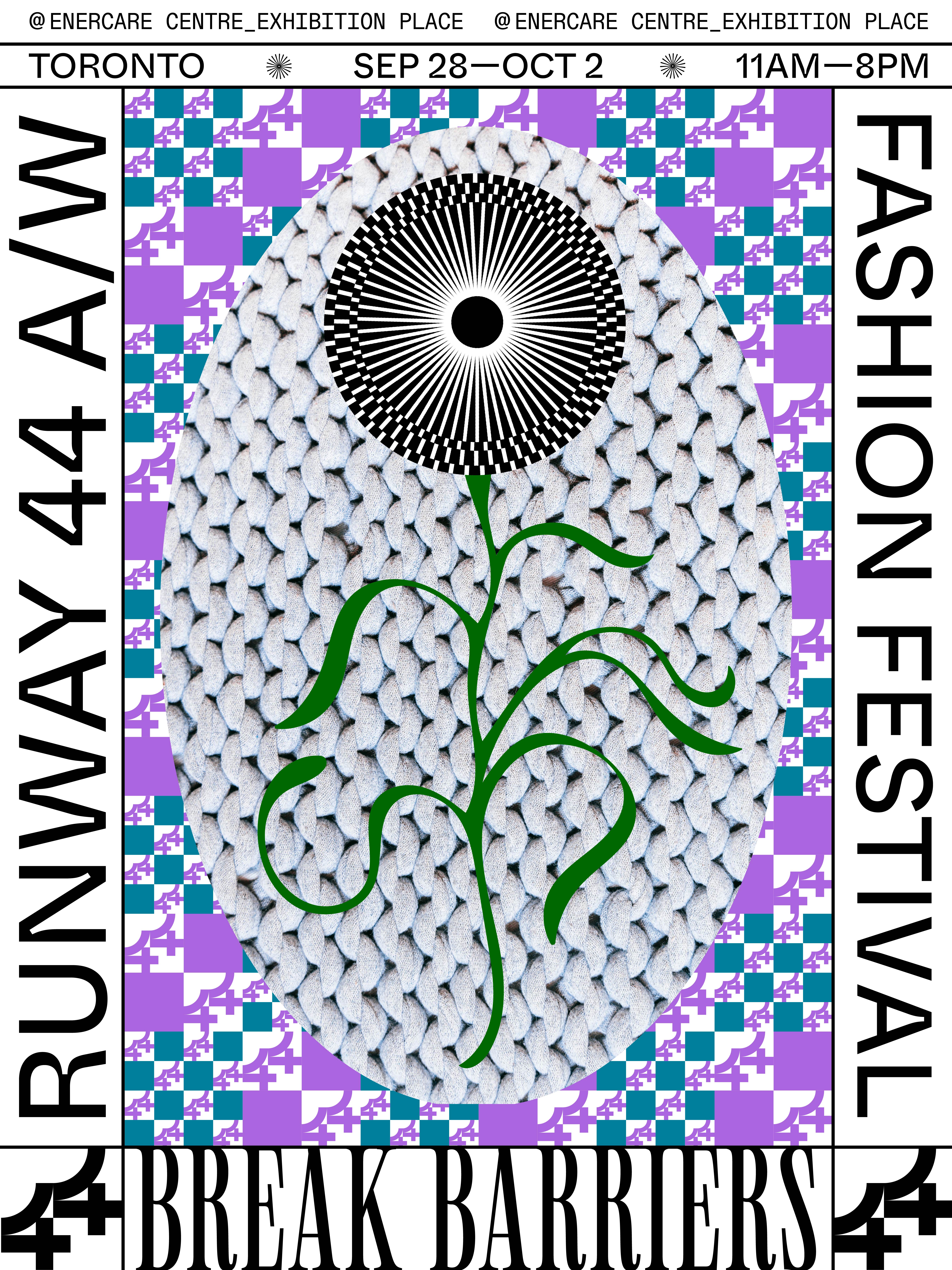
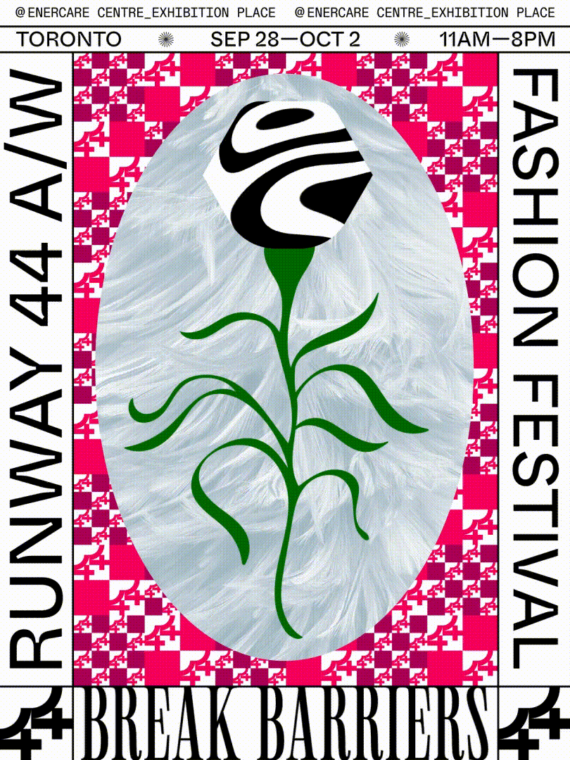
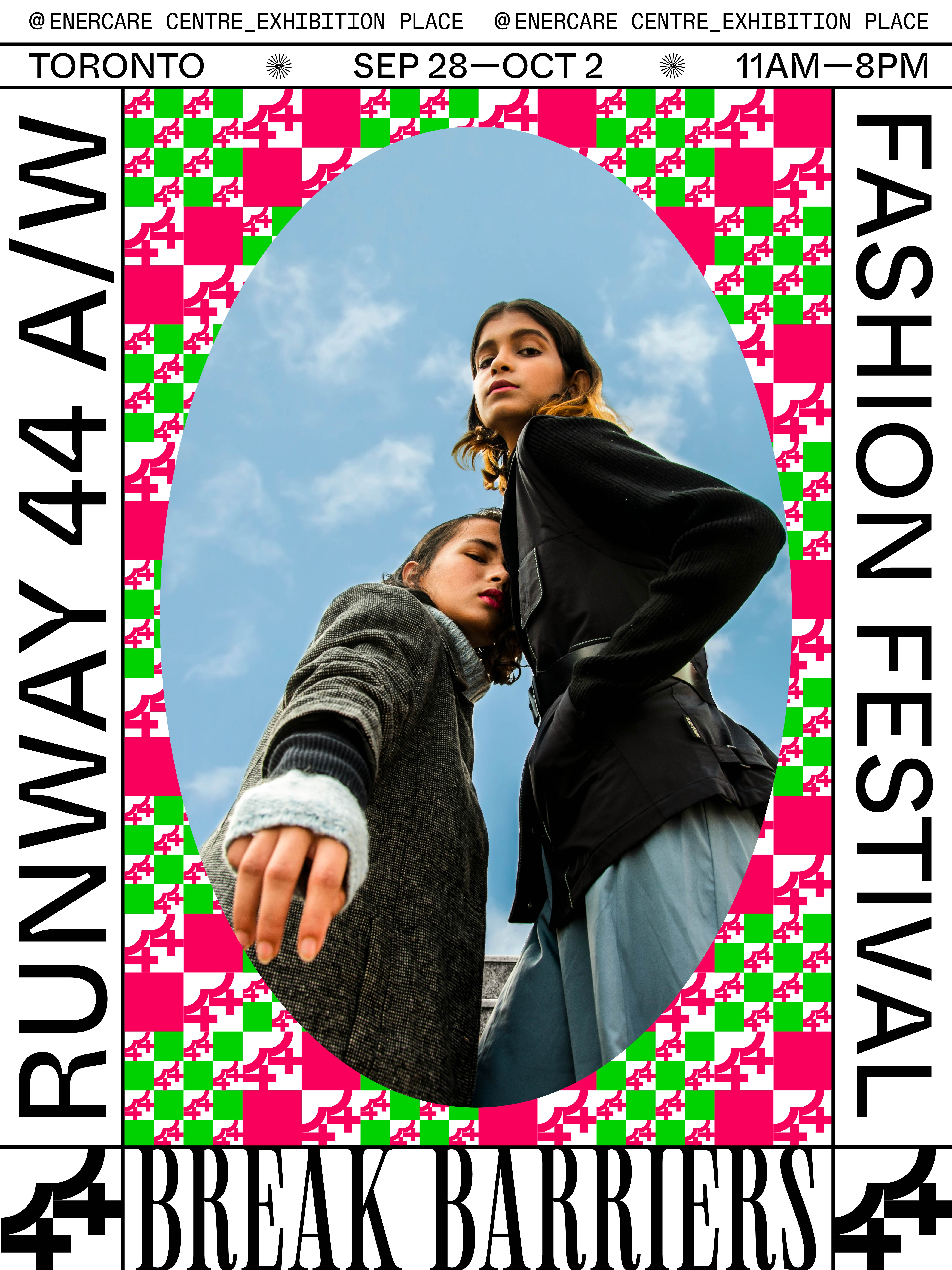
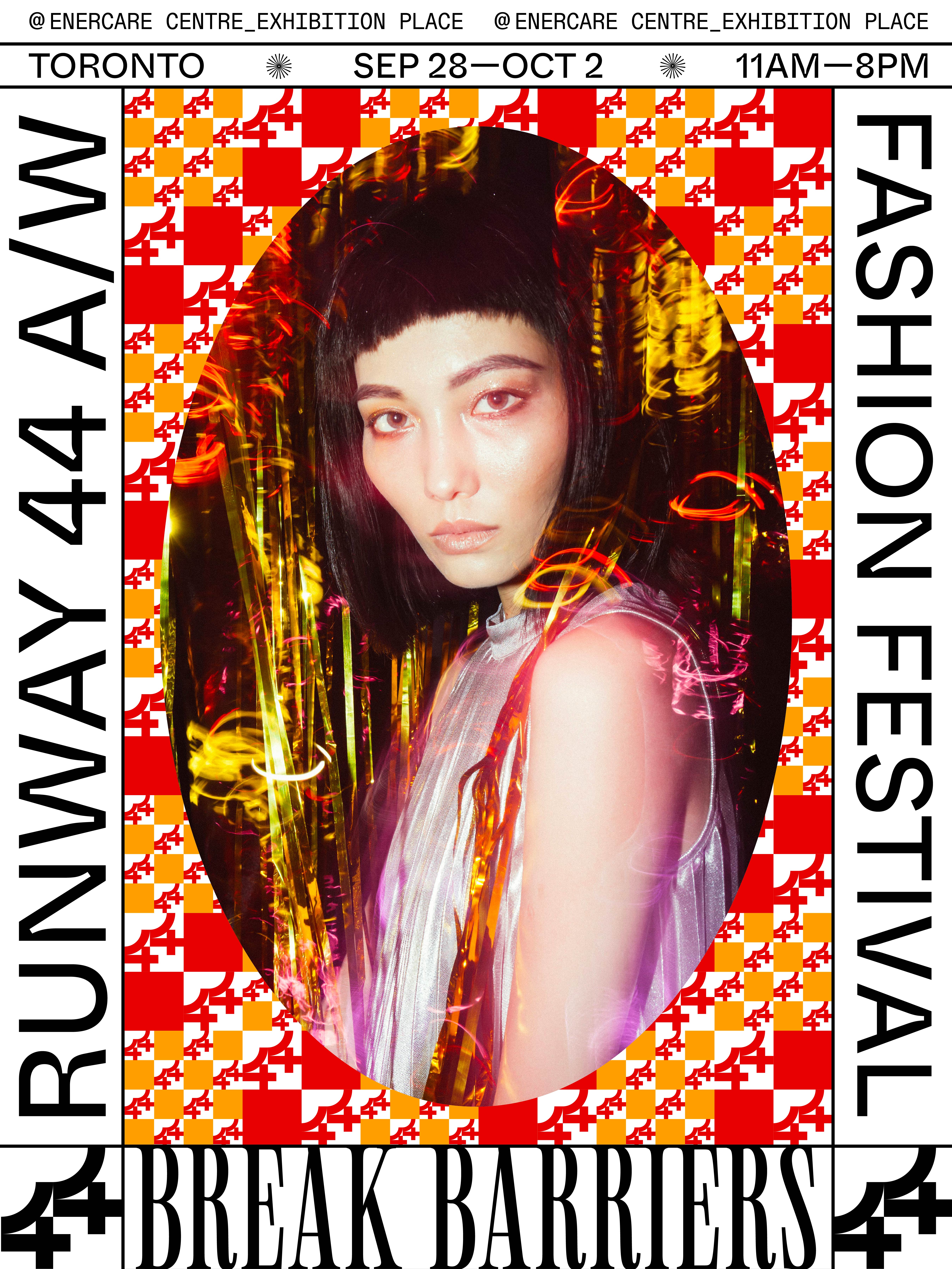
RUNWAY 44 is a fashion event held in Toronto twice a year, bringing together brands accessible to young target audiences. This festival celebrates the diversity of Toronto’s populace, encourages confidence, and breaks traditional fashion norms. It represents an energetic space where fashion is a reflection of the vibrant culture of Toronto.
Recognition
Concept Development Program - Campaign
Issued by Applied Arts Inc · Jun 2024
Entire Design Program - Campaign
Issued by Applied Arts Inc · Jun 2024
Website Design - Single
Issued by Applied Arts Inc · Jun 2024
Kyoto Global Design Award 2024 - Visual
Issued by Kyoto Global Design Awards · Oct 2024
Concept Development Program - Campaign
Issued by Applied Arts Inc · Jun 2024
Entire Design Program - Campaign
Issued by Applied Arts Inc · Jun 2024
Website Design - Single
Issued by Applied Arts Inc · Jun 2024
Kyoto Global Design Award 2024 - Visual
Issued by Kyoto Global Design Awards · Oct 2024
Emerging Graphic Designer of the Year
DNA Paris Design Awards 2024 · Jul 2024
Graphic Design/Branding
DNA Paris Design Awards 2024 · Jul 2024
Graphic Design/Colorful Project
DNA Paris Design Awards 2024 · Jul 2024


Mission
RUNWAY 44 celebrates three communities with strong symbiotic relationships: fashion, music and Torontonian culture. Its mission is to celebrate the fashion industry and inner beauty through its engagement with fashion while supporting young and future designers in Toronto’s fashion community. The theme of the festival, taking place in the fall of 2024, is “Break Barriers". It celebrates diversity, encourages confidence, and breaks the barriers of traditional fashion norms.
RUNWAY 44 celebrates three communities with strong symbiotic relationships: fashion, music and Torontonian culture. Its mission is to celebrate the fashion industry and inner beauty through its engagement with fashion while supporting young and future designers in Toronto’s fashion community. The theme of the festival, taking place in the fall of 2024, is “Break Barriers". It celebrates diversity, encourages confidence, and breaks the barriers of traditional fashion norms.
Brand Strategy
Various colour options and photo directions are utilized to showcase each brand and style in this multicultural fashion show. Additionally, flowers are incorporated as a motif to celebrate the blooming of individual styles and the flourishing of young talent in Toronto’s fashion scene. The background patterns are created by the logo, representing the mosaic city of Toronto.
Brand Attributes
BOLD / VIBRANT / CONFIDENT /
UNIQUE / PASSIONATE / EMPOWERING
Various colour options and photo directions are utilized to showcase each brand and style in this multicultural fashion show. Additionally, flowers are incorporated as a motif to celebrate the blooming of individual styles and the flourishing of young talent in Toronto’s fashion scene. The background patterns are created by the logo, representing the mosaic city of Toronto.
BOLD / VIBRANT / CONFIDENT /
UNIQUE / PASSIONATE / EMPOWERING


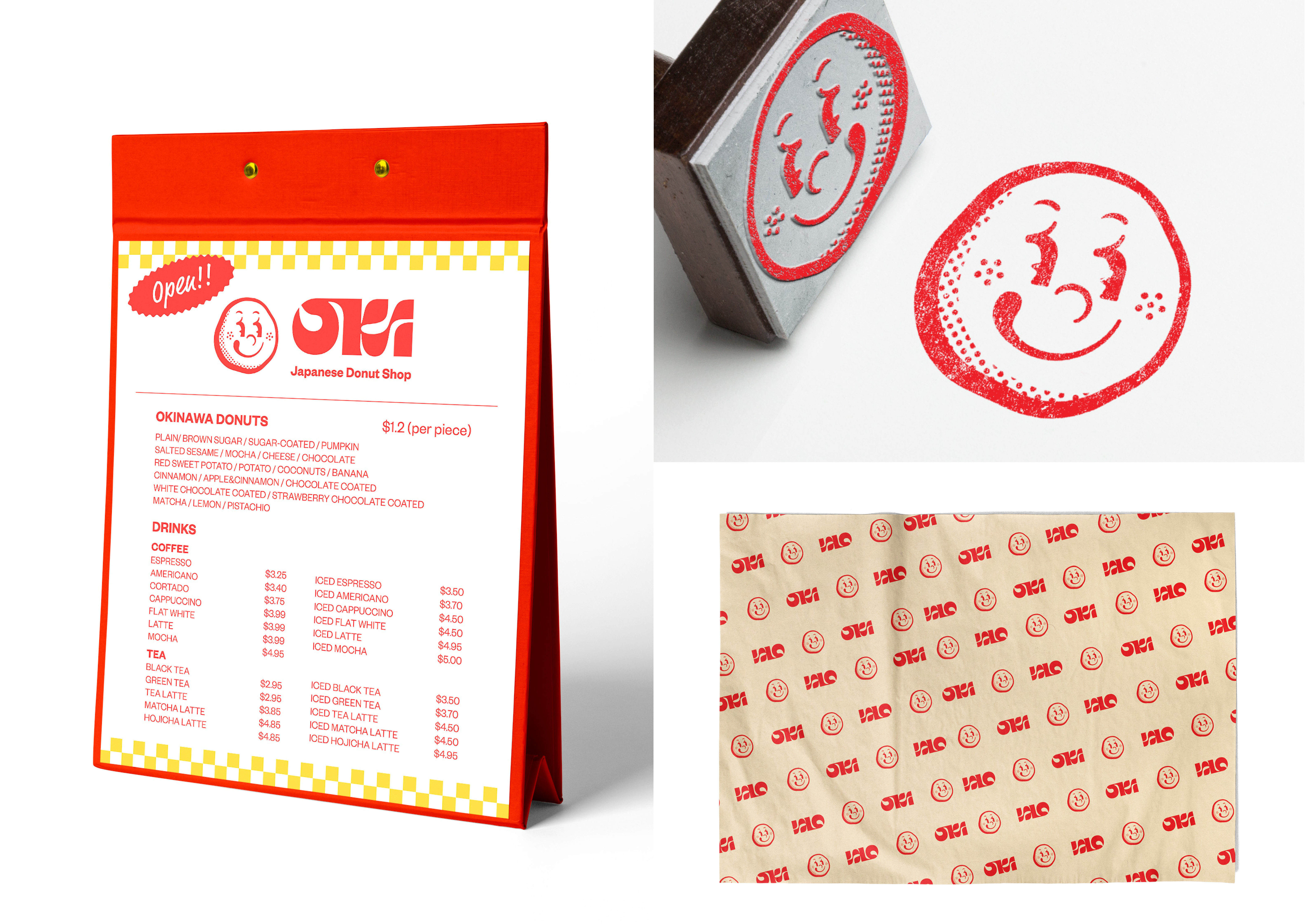
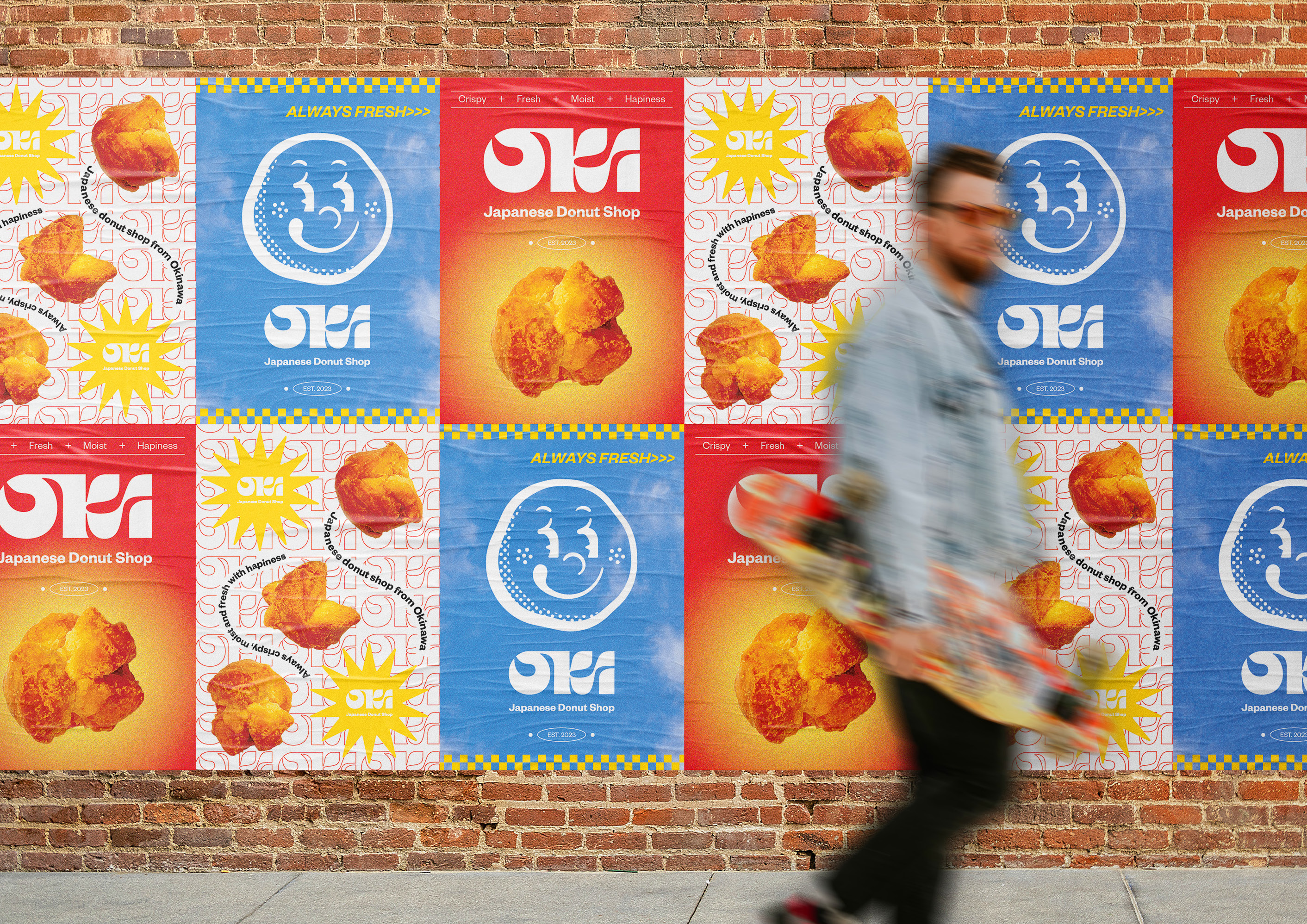
OKI DONUT SHOP
Branding
Corporate Identity
Corporate Identity
OKI Donut Shop is a brand offering traditional Japanese-style donuts from Okinawa, selling crispy, small, old fashion bits. It aspires to be a welcoming, approachable brand that brings joy and happiness. The goal is to provide customers with smiles through delicious donuts and bright packages.
Recognition
Brand Identity Design Program - Campaign
Issued by Applied Arts Inc · Jun 2023
Arnold Street Media Award for Logo Design
Issued by The Association of Registered Graphic Designers (RGD) · Sep 2023
SLD Award for Retail Design - Honourable Mention
Issued by The Association of Registered Graphic Designers (RGD) · Sep 2023
RGD Branding Award - Integrated Award: Branding Program
Issued by The Association of Registered Graphic Designers (RGD) · Oct 2023

Logo
The OKI Donut Shop logo introduces traditional Okinawan pastries to the North American coffee and pastry market with a design that exudes happiness and approachability. It blends Japanese and Okinawan cultures, using a round logo resembling the Japanese flag and a smiling donut to convey joy. The “OKI” acronym, containing “OK,” adds positivity. The red and white colors signify vitality and purity. This versatile design extends to packaging, wrapping, stamps, menus, and social media to create a cohesive in-store and out-of-store experience.
Audience
The target audience includes families and young people who enjoy indulging in donuts paired with a cup of coffee. It’s for those who cherish good conversations and delightful, tasty experiences. The brand aims to offer kindness and smiles to customers through delicious donuts.


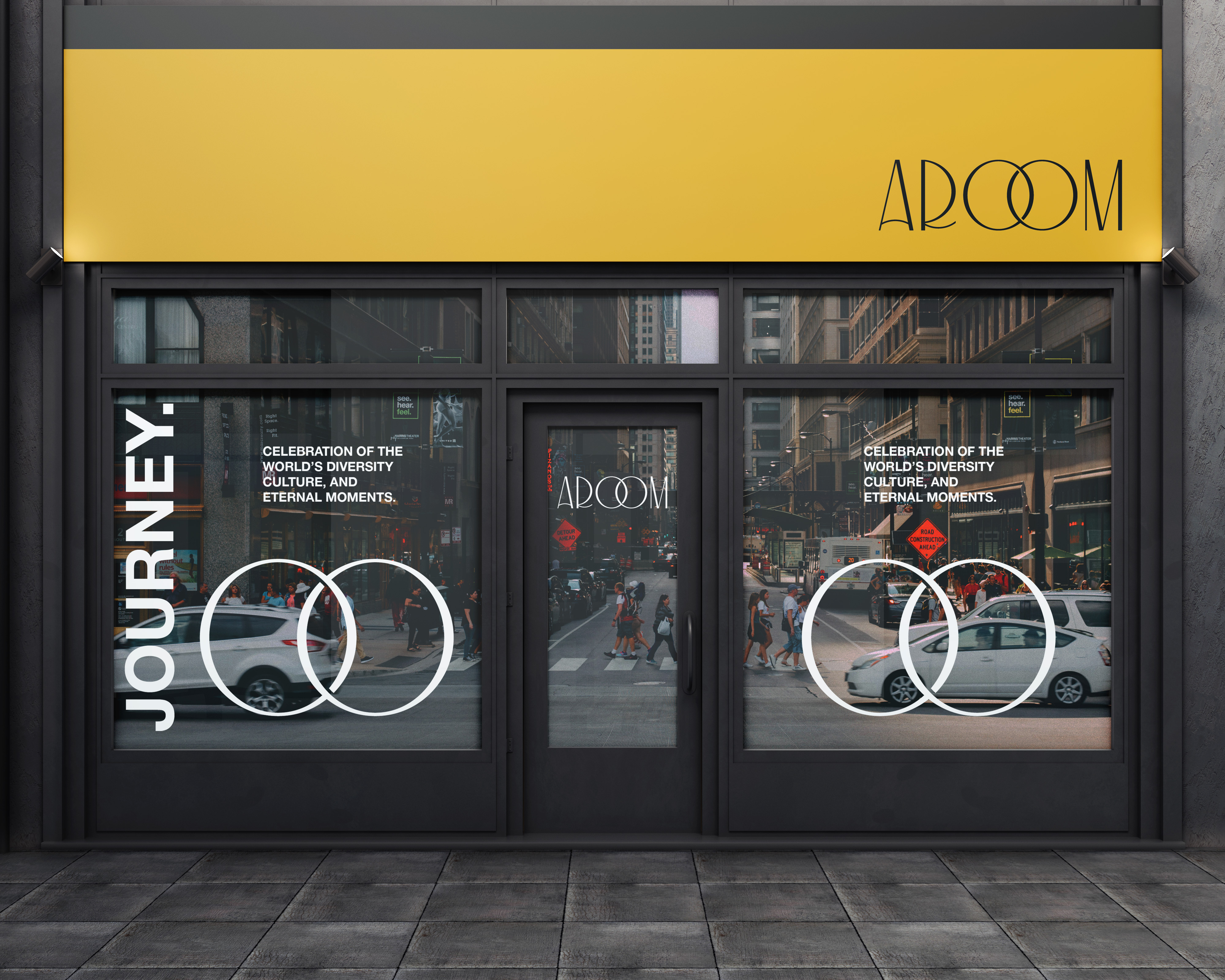
AROOM
Branding
Corporate Identity
Corporate Identity
AROOM is a fragrance brand blending various ingredients, cultures, and philosophical concepts from around the world. Integrating these elements with modern design, it offers an ambiance of comfort and a unique experience for customers’ special moments.
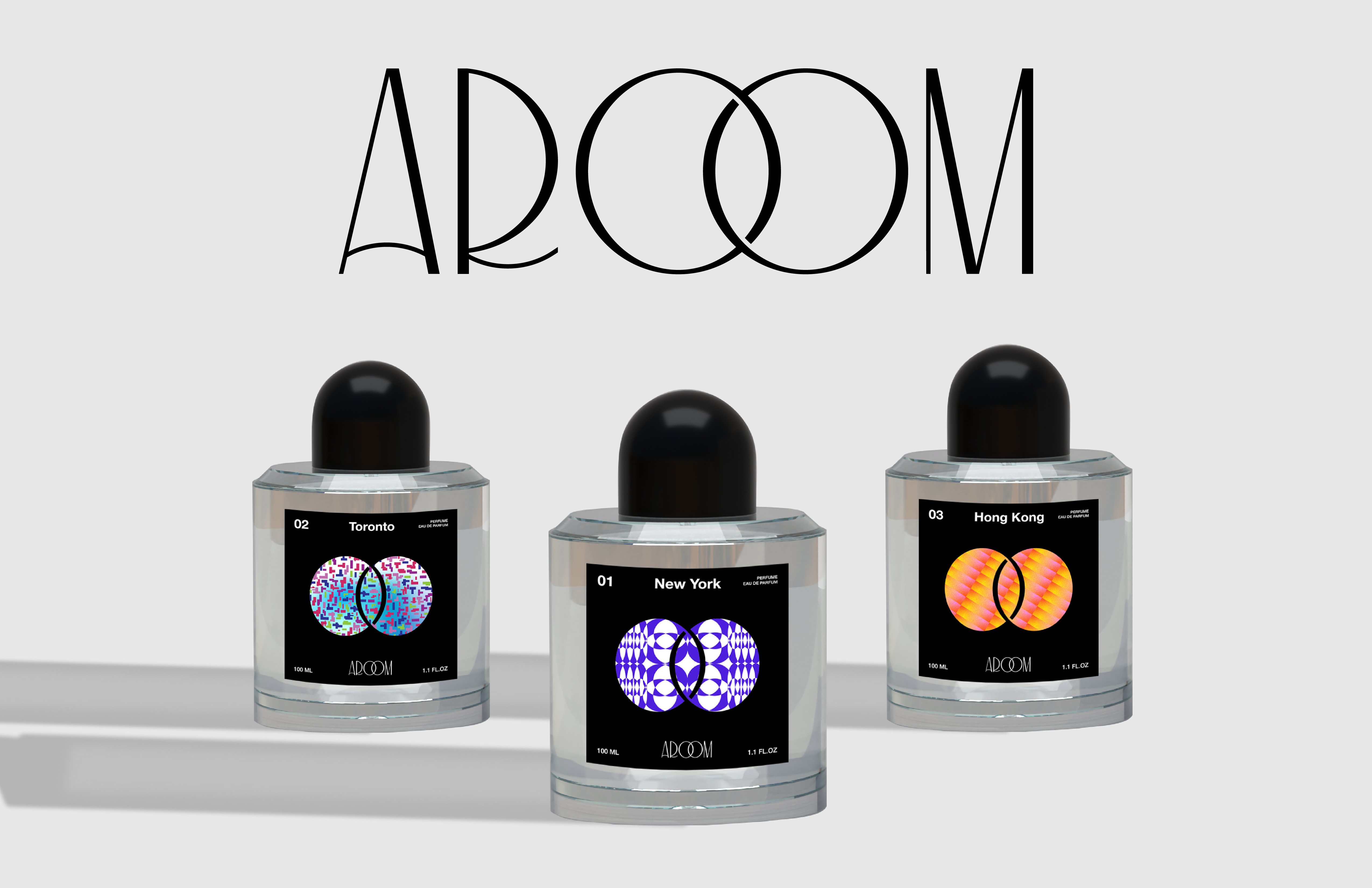

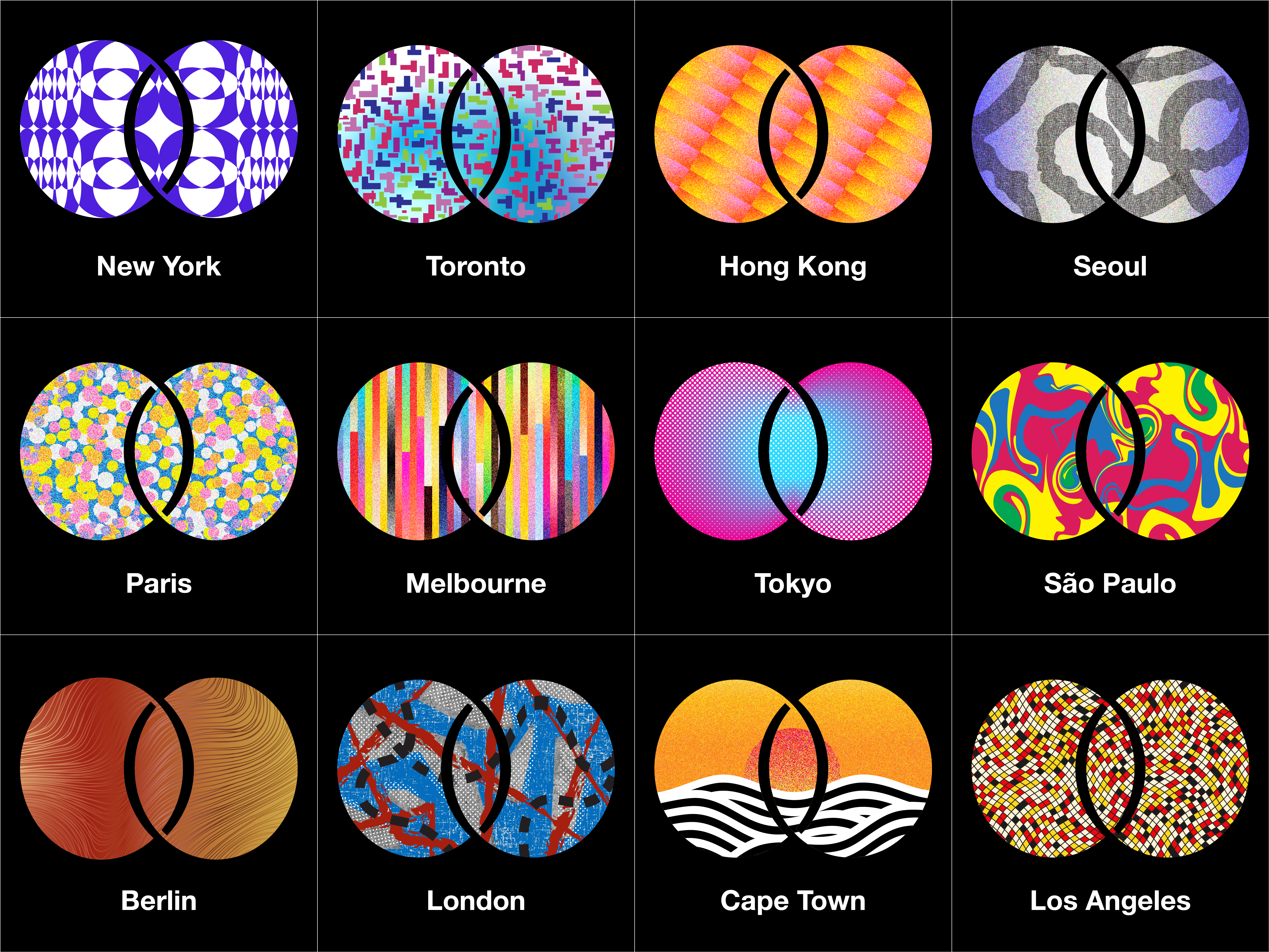


Through this project, I aspire to take the fragrance beyond the ordinary, crafting a sensory journey that transcends time and memories. It is a celebration of global diversity and a tribute to individual self-expression. This whole branding approach mirrors human emotions and memories, reflects a diversity of cultures, and depicts an infinity of cherished moments. AROOM is designed to evoke happiness through the universal language of scent, transcending cultural barriers and uniting us in our shared human experience.
NAMING
1. “A Room” Fragrance
The brand name AROOM plays on the phrase “A room,” evoking a sense of personal space, comfort, and relaxation. Just like a room can be a sanctuary where one feels at ease, AROOM fragrances aim to create a similar ambiance through their carefully crafted scents.
2. Aroma Brand
AROOM comes from the word Aroma to embody the essence of the fragrances. The word Aroma emphasizes the core element of scent and the brand’s dedication to crafting captivating olfactory experiences.
3. Infinity; Eternal Moment
The brand name AROOM incorporates the concept of infinity by connecting the two O characters, creating a visual representation of eternal moments. This design element symbolizes the everlasting time of the brand’s fragrances and its ability to evoke timeless memories and emotions. The interconnected OOs capture the essence of infinity and connection with the brand and customer. It serve as a constant reminder of the brand’s commitment to creating scents that are loved by all over a long period.
The brand name AROOM incorporates the concept of infinity by connecting the two O characters, creating a visual representation of eternal moments. This design element symbolizes the everlasting time of the brand’s fragrances and its ability to evoke timeless memories and emotions. The interconnected OOs capture the essence of infinity and connection with the brand and customer. It serve as a constant reminder of the brand’s commitment to creating scents that are loved by all over a long period.


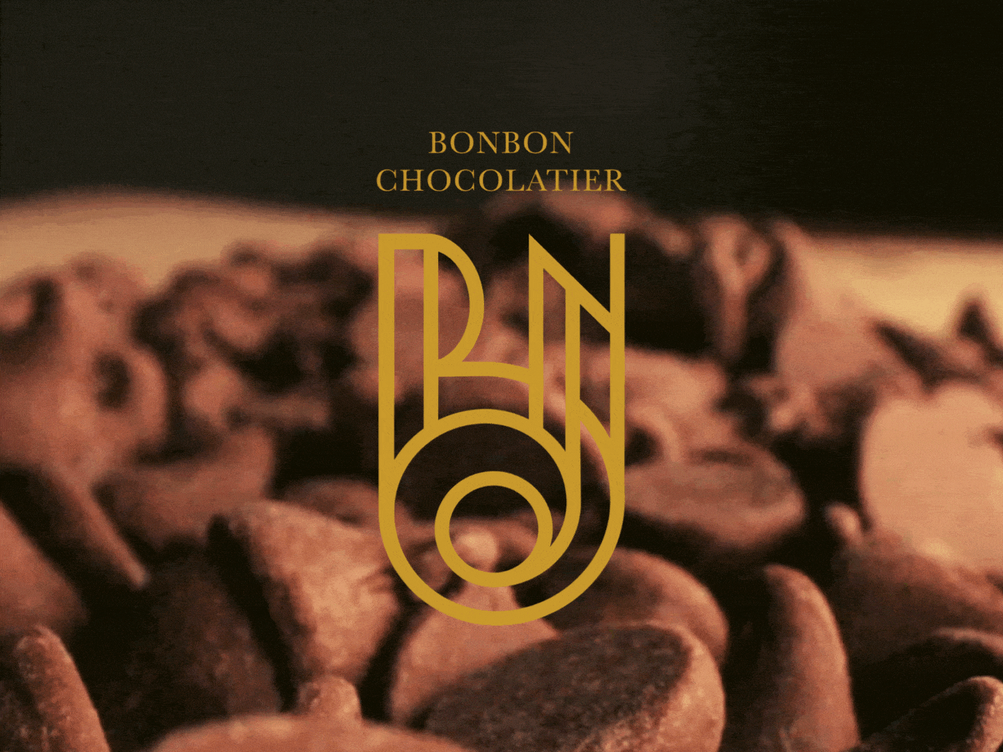
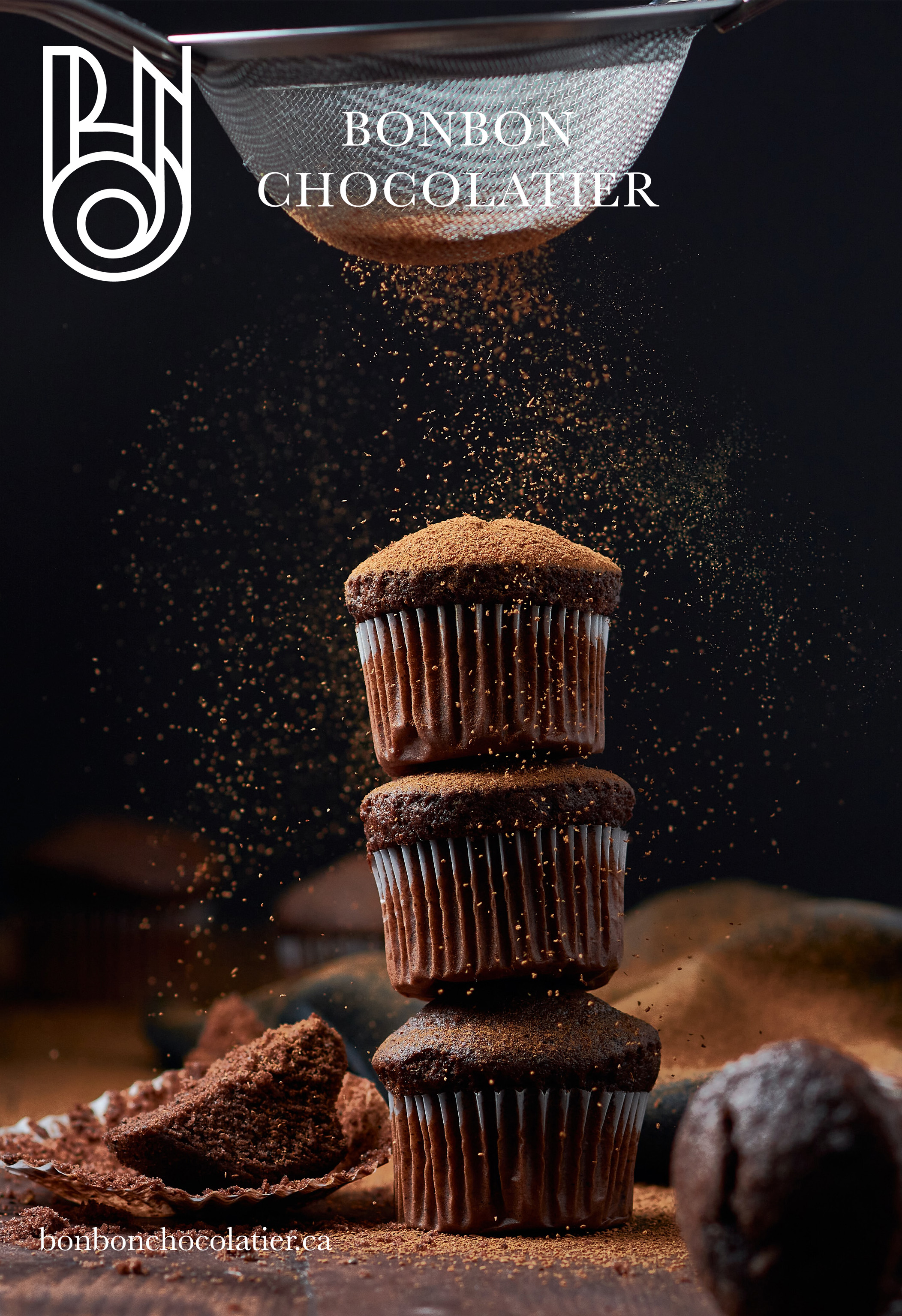
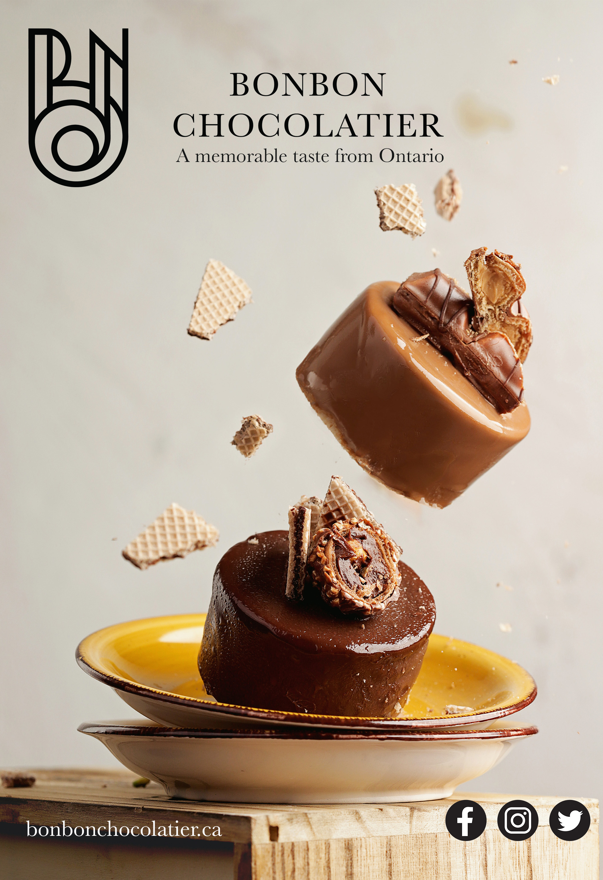
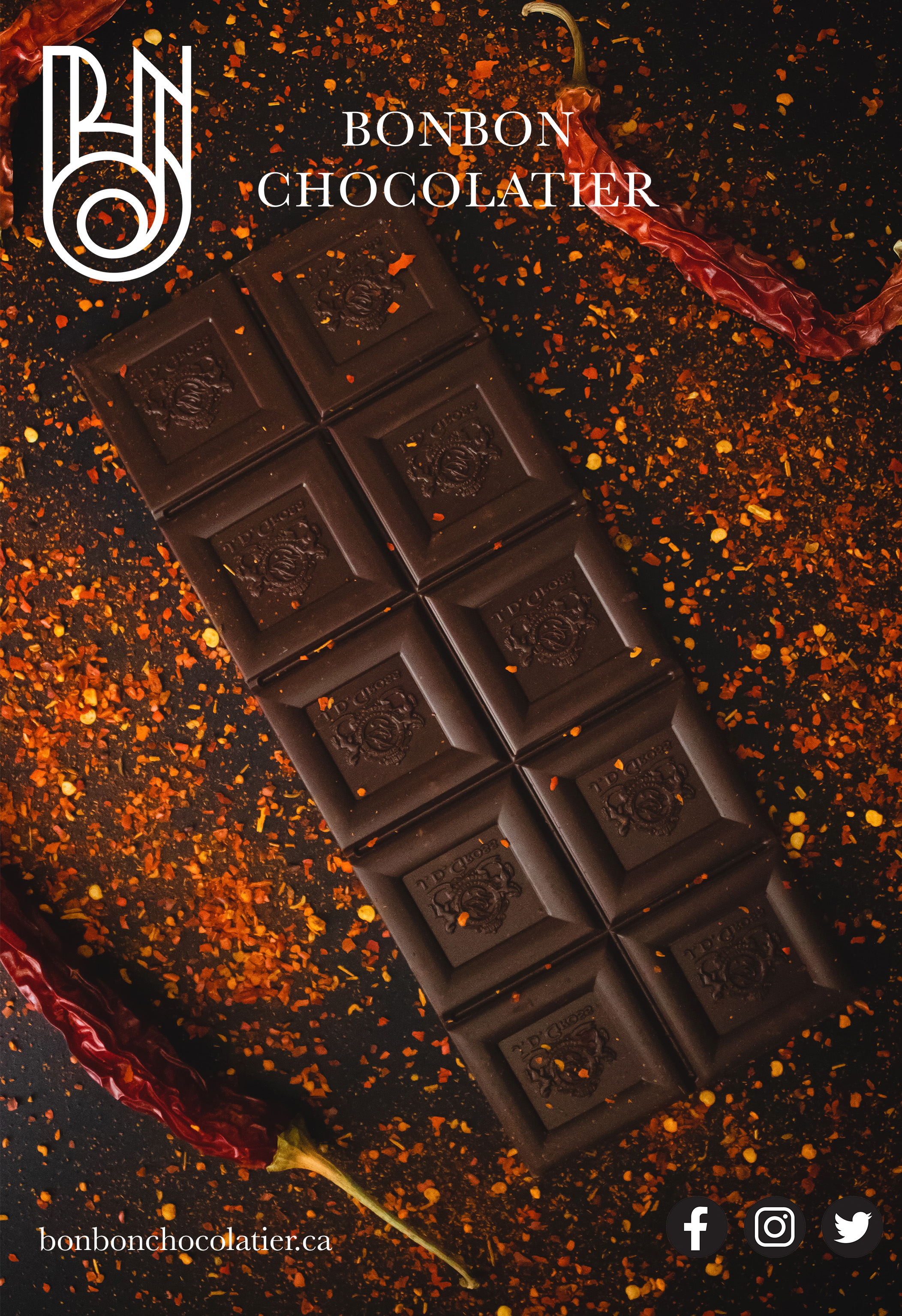
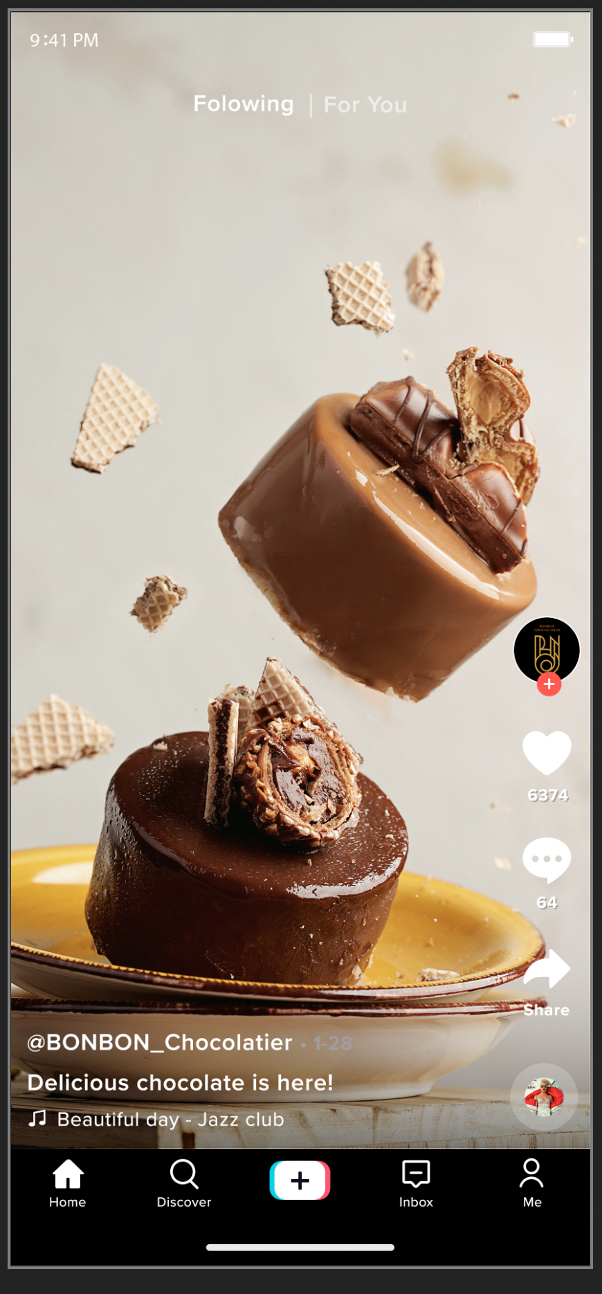
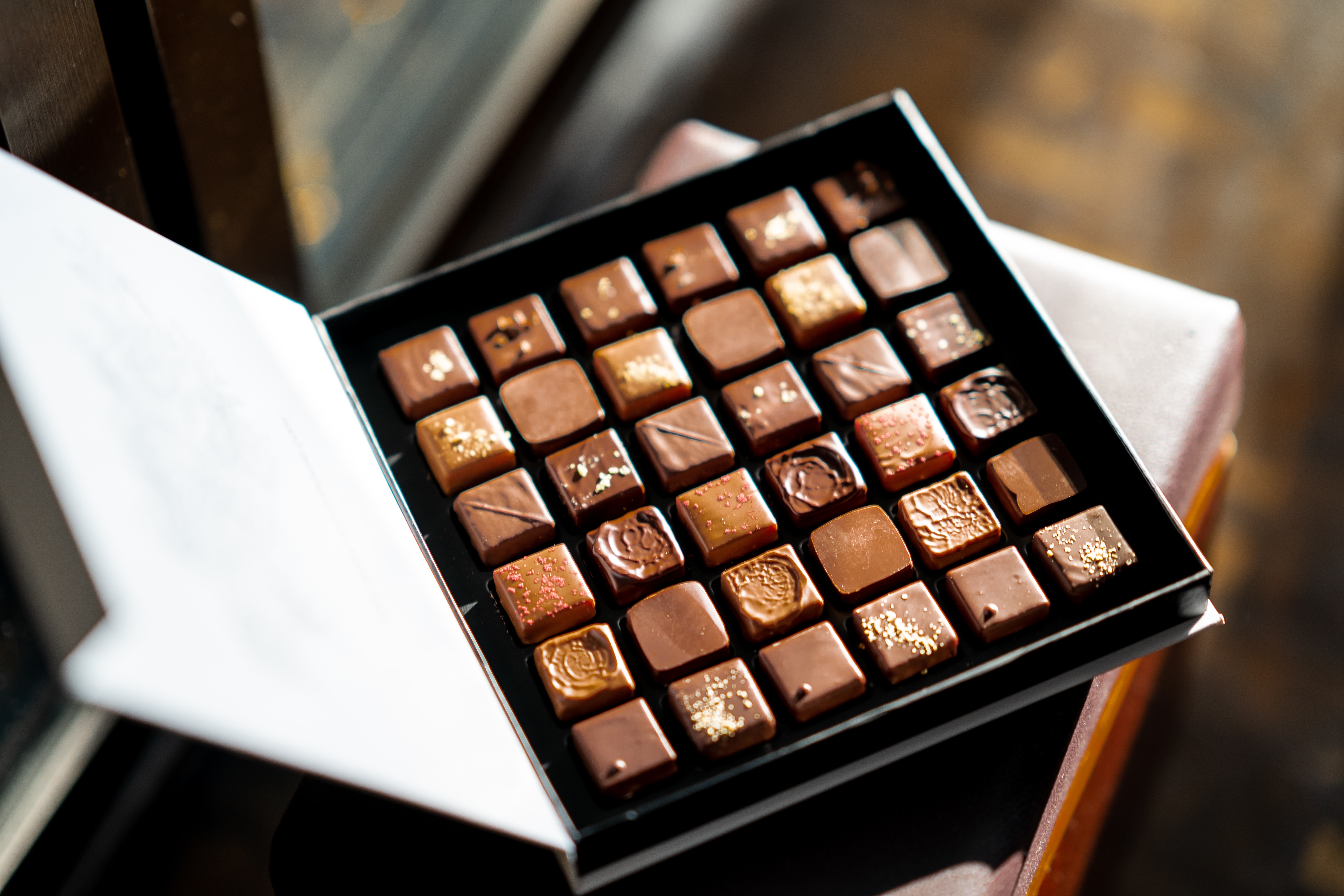
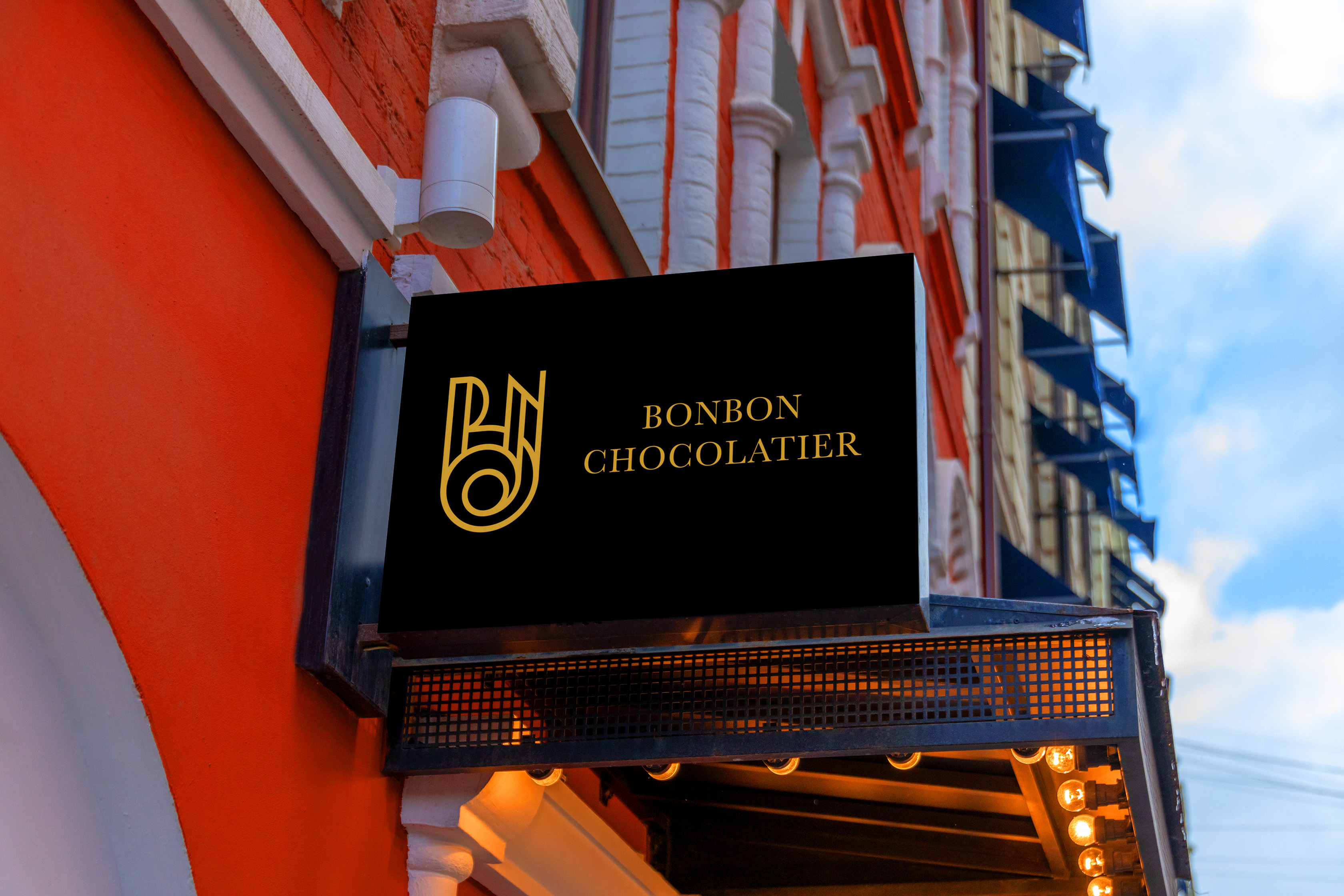
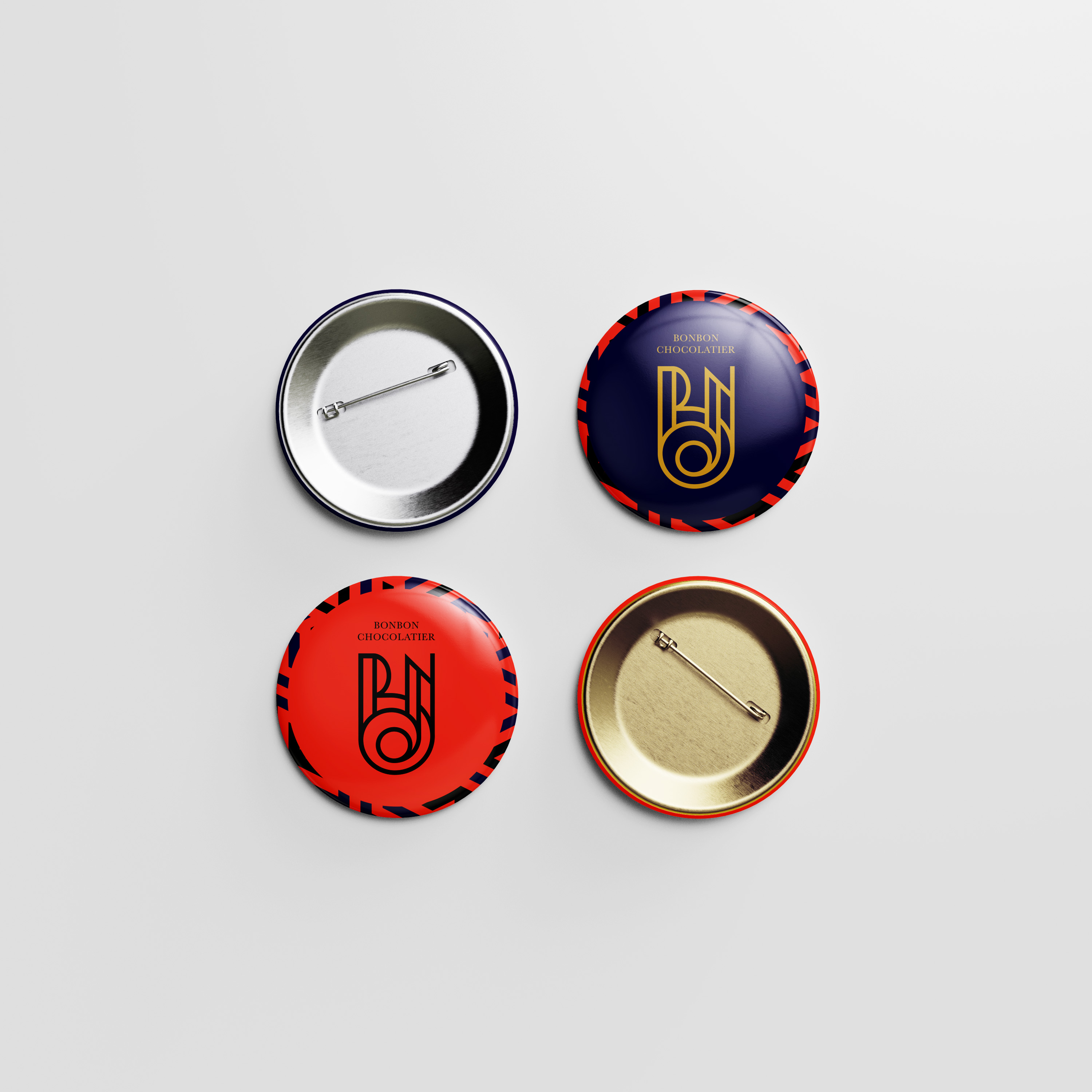
BON BON CHOCOLATIER
Branding
Corporate Identity
Corporate Identity
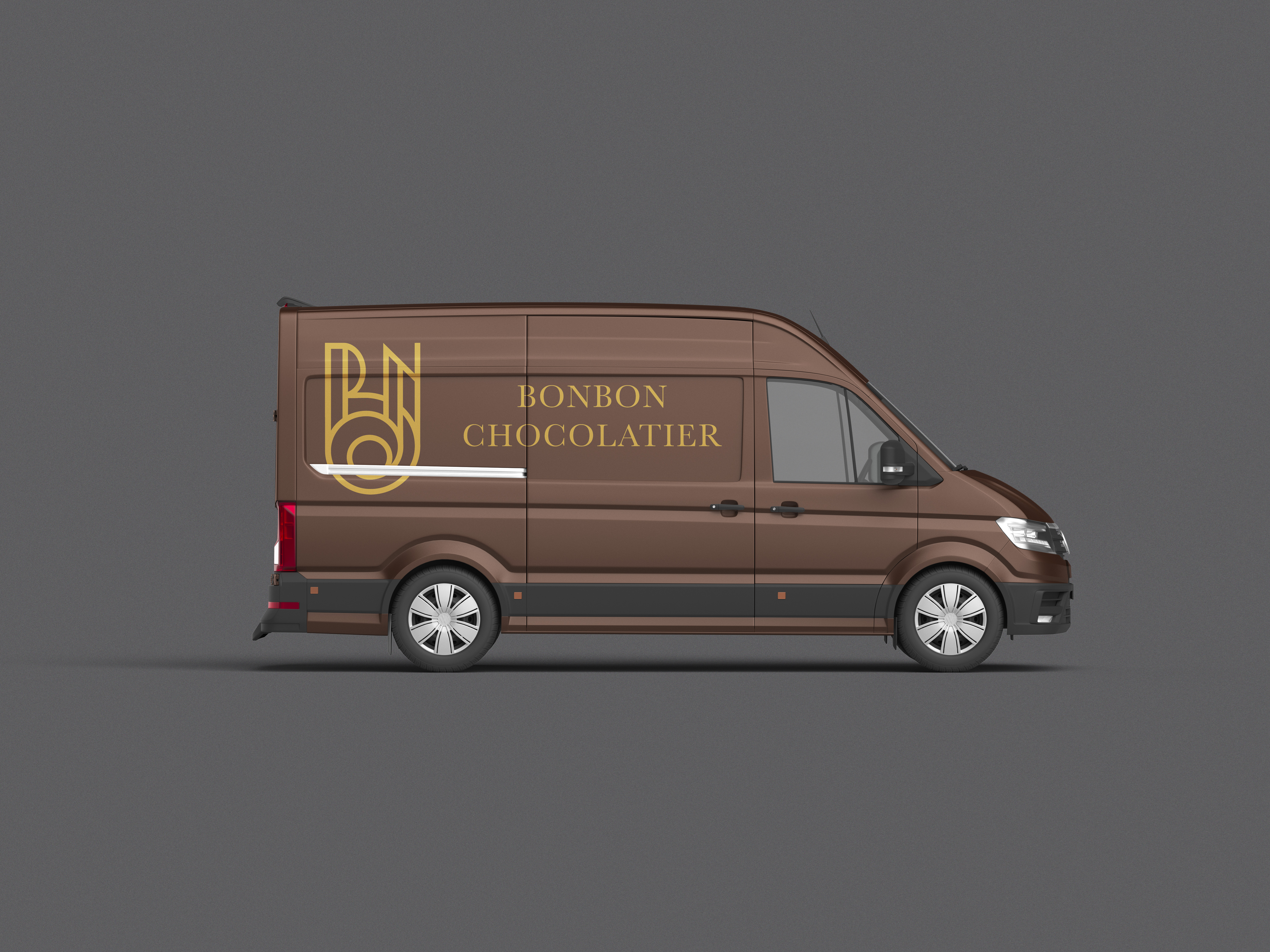
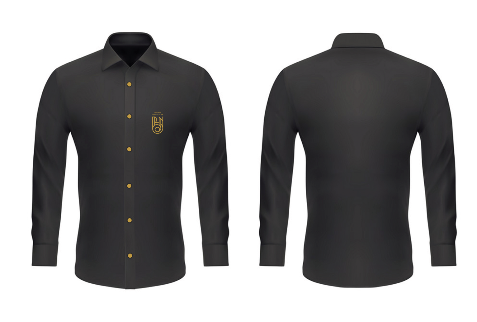
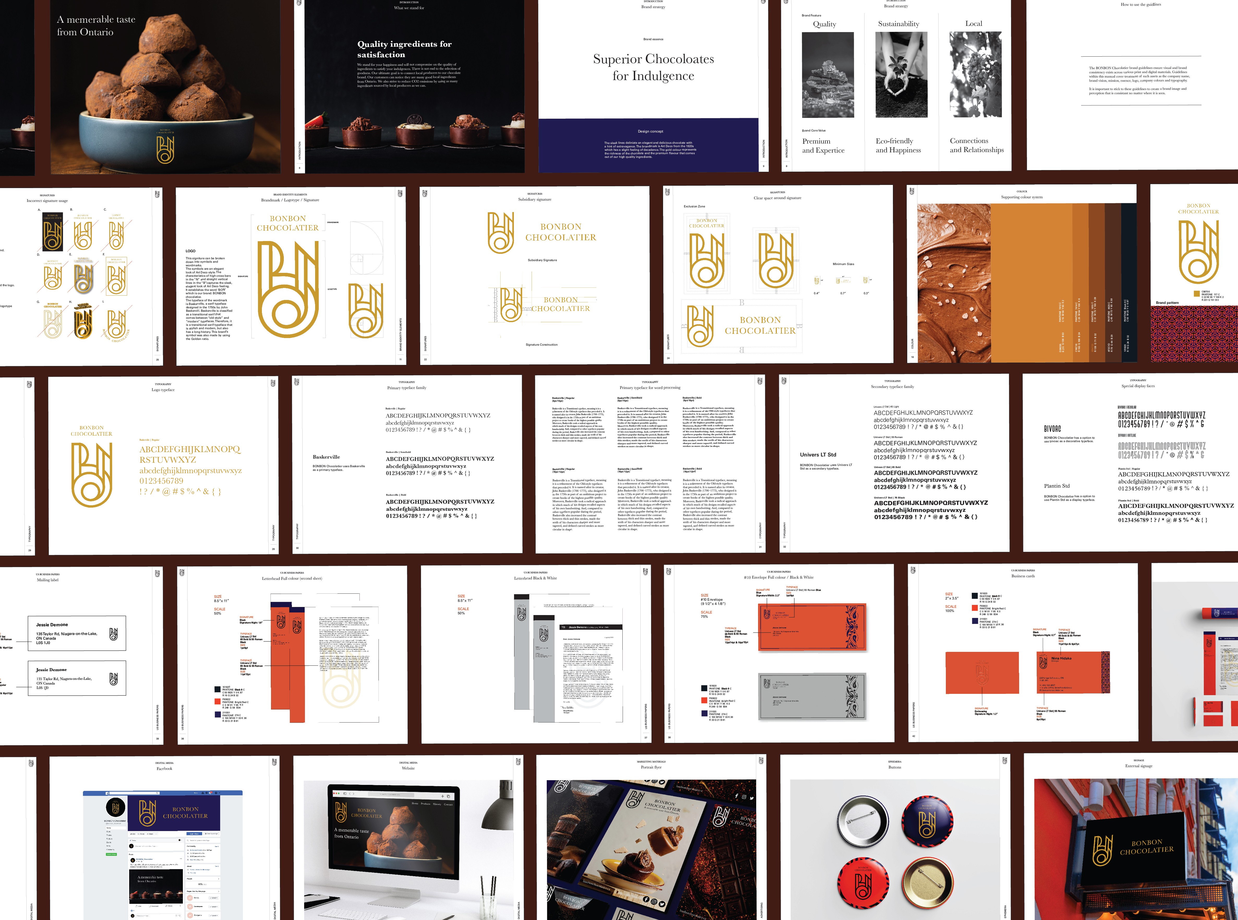
BONBON Chocolatier is a chocolate shop based locally in Ontario. The brand guideline book includes brand concepts, values, logo usage, stationary, exhibits, merchandise and more. The brand book was made to be consistent throughout with an elegant, high-quality and unique feel.

Design Concept
The sleek lines deliniate an elegant and delicious chocolate with a hint of extravagance. The brandmark is Art Deco from the 1920s which has a slight feeling of decadence. The gold colour represents the richness of the chocolate and the premium flavour that comes out of our high quality ingredients.
The sleek lines deliniate an elegant and delicious chocolate with a hint of extravagance. The brandmark is Art Deco from the 1920s which has a slight feeling of decadence. The gold colour represents the richness of the chocolate and the premium flavour that comes out of our high quality ingredients.
Logo
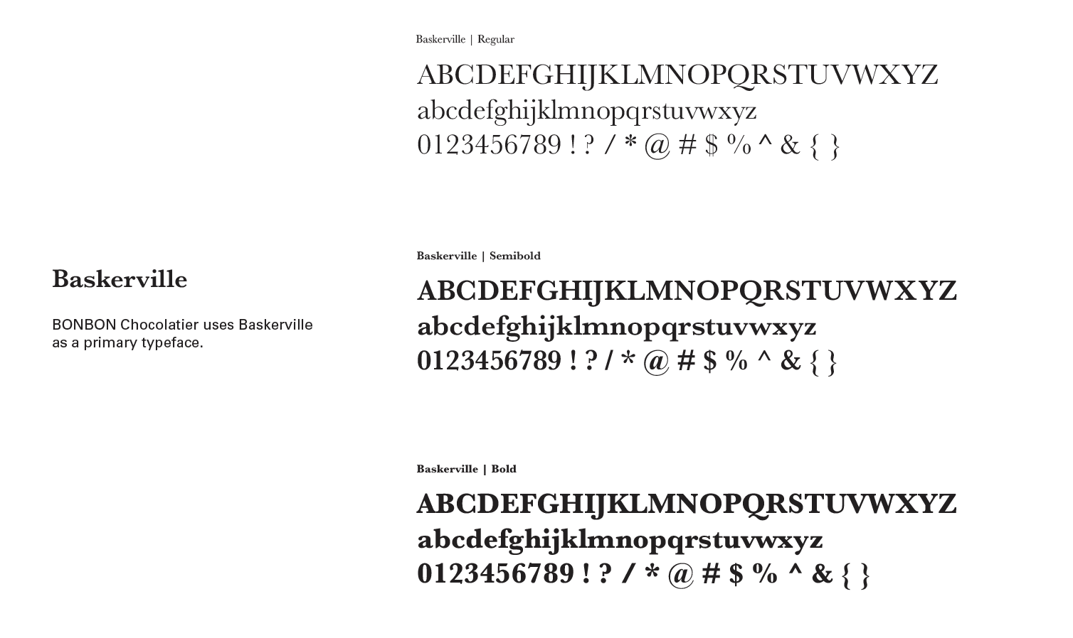
This signature can be broken down into symbols and Wordmarks. The symbols are an elegant look of Art Deco style. The characteristics of high cross bars in the “N” and straight vertical lines in the “B” capture the sleek, elegant look of Art Deco feel. It establishes the word “BON” which is our brand: BONBON Chocolatier. The typeface of the wordmark is Baskerville, a serif typeface designed in the 1750s by John Baskerville. Baskerville is classified as a transitional serif that comes between “old-style” and “modern” typefaces. Therefore, it is a transitional serif typeface that is stylish and modern but also has a long history. The brand symbol was also made using the Golden ratio. The Golden Ratio used in the logo design represents the company’s philosophy of rich and tasty chocolate created in perfect proportions.
This signature can be broken down into symbols and Wordmarks. The symbols are an elegant look of Art Deco style. The characteristics of high cross bars in the “N” and straight vertical lines in the “B” capture the sleek, elegant look of Art Deco feel. It establishes the word “BON” which is our brand: BONBON Chocolatier. The typeface of the wordmark is Baskerville, a serif typeface designed in the 1750s by John Baskerville. Baskerville is classified as a transitional serif that comes between “old-style” and “modern” typefaces. Therefore, it is a transitional serif typeface that is stylish and modern but also has a long history. The brand symbol was also made using the Golden ratio. The Golden Ratio used in the logo design represents the company’s philosophy of rich and tasty chocolate created in perfect proportions.


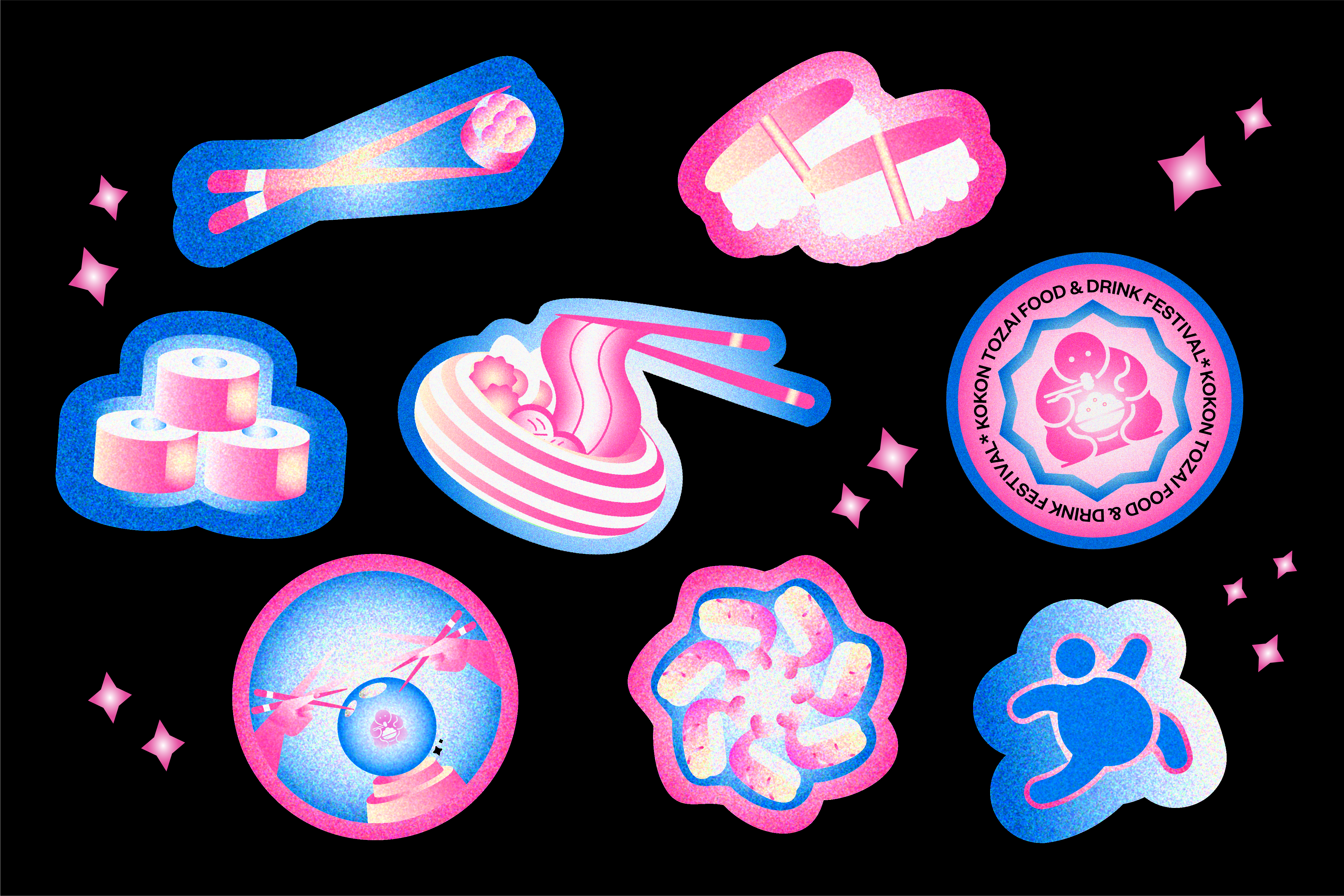
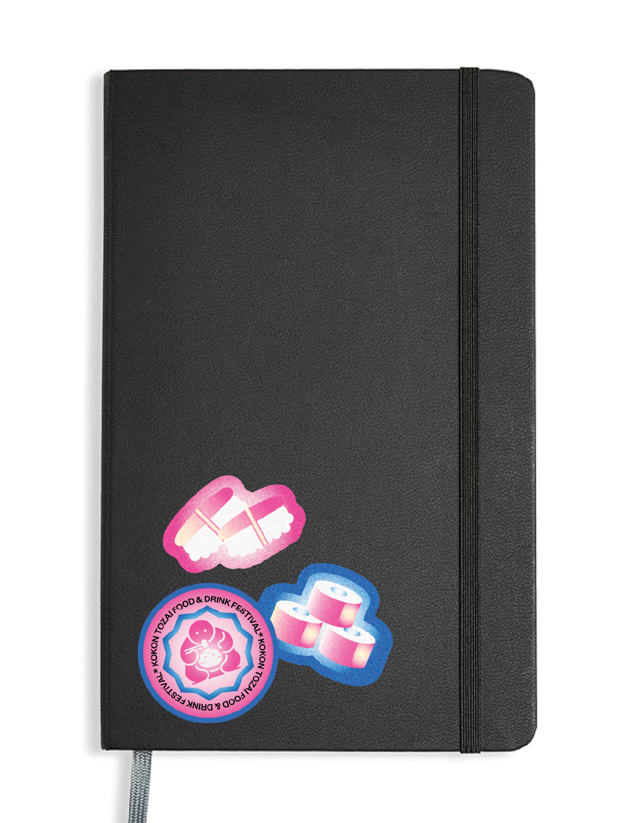
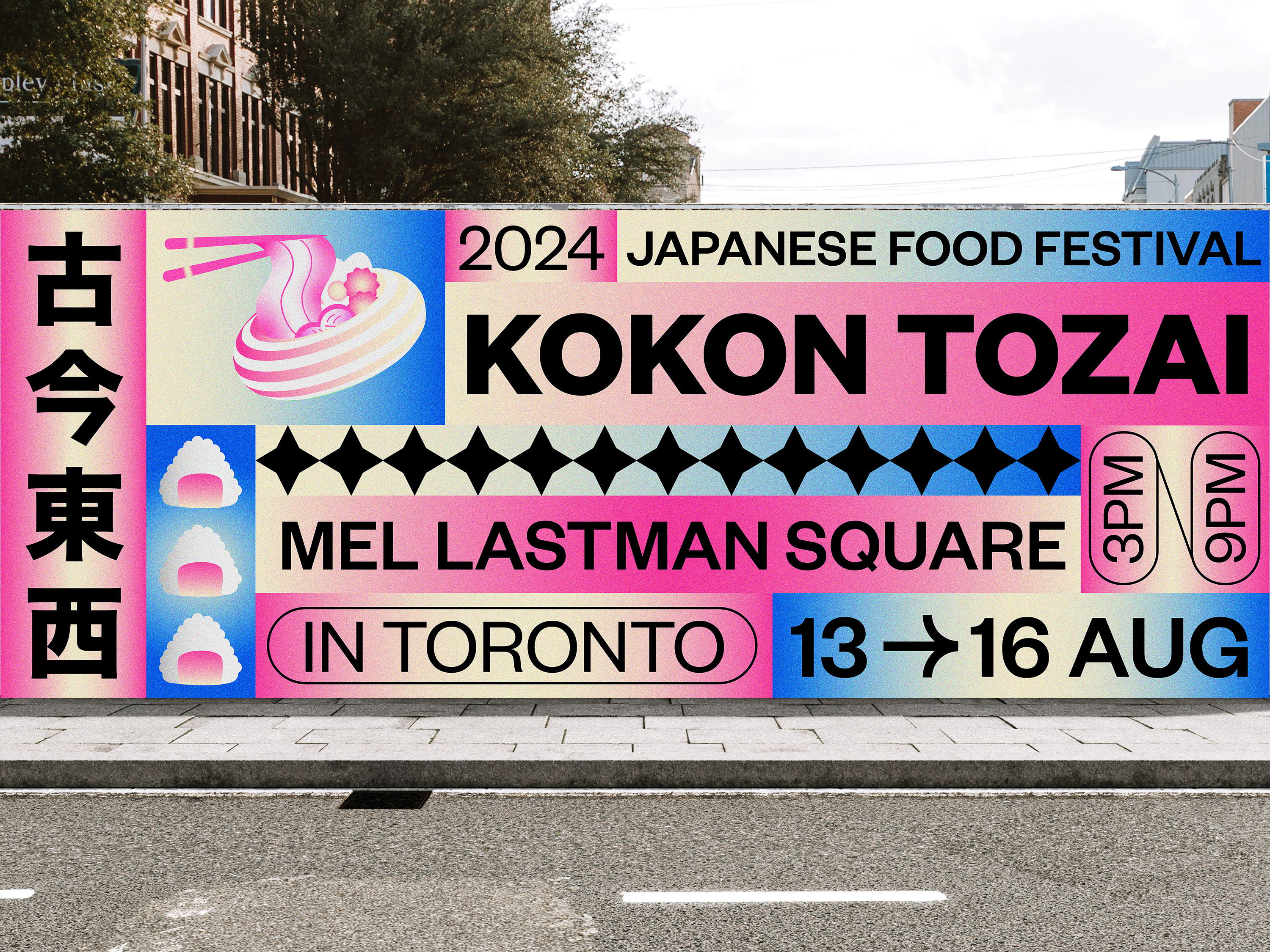
KOKON TOZAI
Branding
Placemaking
Placemaking
Collaborated with
Pantea Kouhpayeh
Pantea Kouhpayeh
The Japanese food festival “KOKON TOZAI,” which takes place in Toronto, is a fun way to celebrate Japanese cuisine. The design highlights aspects of Japanese food and combines the festival’s theme with an appealing mix of red and blue tones. The ads and poster highlight the enjoyment of Japanese eating by inviting visitors to take part in a feast for the senses.